Saturday 22 March 2014

Three

Gosh - its been a week since I last posted. I need to be more organised.

It was such a busy and disorganised week that towards the end of it I just held out for the new 'Less is more' weekly challenge. This week it is 'Three' - a card with three of something, and an additional challenge to comment on three other card entries.

It is also the last of the four weeks in a row I promised myself I'd do to get started with my blog. It has made card making the focus of my blog so far - but that is totally fine by me. I'm sure I'll get to other topics evenually. Plus I've had so many lovely and supportive comments about my cards - so I will probably carry on following the Less is More challenge ... I may even put my toes in the water and enter a few others. All this practice must be good :-)

The second part of this challenge is easy. I like looking at what everyone has made and how they've interpreted the challenge. There are always so many ideas I wish I'd thought of ...

To the first part ... I'm lucky in a way - being in New Zealand means I get to see the challenge come up on Saturday evening our time - so I can sleep on it. Anyway I woke up this morning with a thought about a stamp I have not used for a while & an idea of how I would like to use it. I have spent most of the day experimenting and now want to try it in different colour combinations.

Here is my card

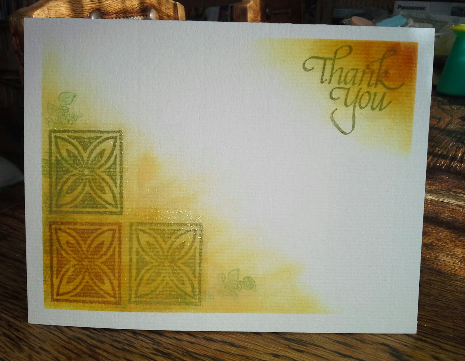
I masked the corner and inked it with a little wild honey, scattered straw and antique linen. I stamped a couple of leaves onto the edges (using the 2nd stamping so they wouldn't be too bold) then stamped my three stamps, and added a 'Thank you' at the top to balance it and because it is a thank you card for a friend on Geoff's. 

I dabbed my small veramark pad over the thank you and the flower motifs and clear embossed them to give a bit of shine (which you can't really see on this becuase the flash made it too shiny .. so I turned it off).

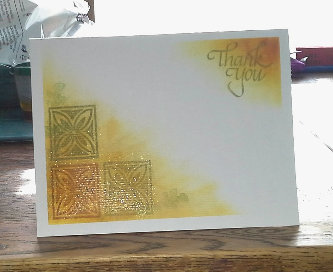
Here it is with the flash on.


I'm quite pleased with how it turned out in the more traditional tapa cloth colours, but now I'd like to try in in turquise, pinks & purples. I just need some time :-)

Well - it is now early Sunday evening here, so I'd better put this aside and cook dinner for the family
Happy stamping - Dianne


Sunday 16 March 2014

More Masking

This is just a quick post to show my further masking experiment.
Last night, while catching up with some pre-recorded TV programmes, I carried out my plan to try a card using torn paper to mask the edges of the card front.

Here's what I finished with


I used the ivy leaf stamp that came with a Craft Stamper magazine. It is a nice easy shape to cut for masking.
I wasn't sure about using black ink, but that was the only waterproof ink I have so on it went.
 I don't know if I need a waterproof ink (I'll have to experiment) but I wasn't preared to stamp and mask, and mask and stamp just to ruin it by smudging when I applied the sponging.

Having left it over night I'm thinking that I might try using bronze embossing powder instead of the black ink ... though I may be setting myself up for failure by trying to line masks up over dim versamark stampings.

I need to adjust the width of my torn paper masks and I need to create more contrast with my blues in the distress ink sponging. All that aside, I'm pretty pleased with it. I even like the lighter blue shadow at the top where one of my masks must have moved mid-inking.

I'll experiment further later, but for now I should be working - so back to it.

thanks for looking and please leave a comment - I love reading them

Dianne


Saturday 15 March 2014

Masked Butterflies

The 'Less is More' challenge this week is to use masking or stencilling on your card. It is not a one layer card week, but somehow mine ended up as a single layer.

I tried some new things for me and had to think them through sequentially to get it to work.
Always satisfying when it does :-)

So here is my card.

I stamped the butterflies first with a lovely free stamp from the Craft Stamper magazine. Needed to mask the first to overlap the second. 

Then I cut an oval from a piece of thin paper. I masked both butterflies, and placed the oval over them. This is something that would have been easier with a clear shape rather than paper - but I managed to line it up reasonably successfully.

I versamarked a crackle stamp and stamped it over the whole surface and then clear embossed it. 

Then I sponged Weathered wood, stormy sky, and tumbled glass distress inks over the surface with in the oval mask (or is it a stencil? if you are working inside it). 

I peeled off my oval and the butterly masks and, using eyeshadow applicator sponges, I added some distress ink colour to my butterflies.

I wasn't planning on adding anything else, but, despite all the masking, I had managed to get a tiny bit of blue ink above my oval, so I added the sentiment.

This was fun to do and I'm thinking that I might try another soon, but with a torn paper mask.

Friday 14 March 2014

Eleanor's birthday Card

Recently I bought some beautiful Chocolate Baroque stamps (the Macintosh sets).
From England to here is a long way so I had to wait for a little while (not too long) and while I was waiting I spent quite a bit of time on the Chocolate Baroque design team's blog admiring the cards they were making using these stamps.

When the stamps arrived it was close to Eleanor's birthday & she really liked the the lady from the Macintosh beauty stamp and the CB designers had made some lovely cards with her - the vellum bride was her favourite, so I based my design on it with a few variations.


 I used tracing paper instead of vellum (I know I have some somewhere, but can't find it) and I used my chalks to colour her and added some stickles to the flowers. So I didn't emboss it and I didn't need to colour the reverse.


I tried using my copic pens but the image seemed too bright and I had trouble blending them - so I put that one aside.

The card itself is very dark purple that I have in my stash, as is the paler card that I versamarked with one of the rose stamps from the set. I glued the tracing paper into place, so the little purple gems are there to hide any traces of glue.

I was pleased with how it came out and Eleanor thought it was lovely, so all up pretty successful.

I have to do a quick rave here - the Chocolate Baroque stamps are really great to work with  - this is the second time I have bought their stamps and they are so detailed and beautiful, I feel like it is a head start just having them.

Saturday 8 March 2014

Spring Flowers

Well, I was expecting all sorts of things for the one layer card challenge at Less is More but not spring flowers ... I have lots of nature stamps, but not really any spring flowers.
Also it is Autumn in New Zealand, so I was flumoxed for a while. Then I remembered one of the first stamps I ever bought. I played around with it and then left it for a while and started cleaning up some of my crafty detritus.

I had a light bulb moment when I came across some experiments I had tried a while ago and had forgotten about.  Lesley on her Paper Engineer blog asked us where we find our inspiration and I can now say that I find mine from cleaning up - perhaps I should try it more often.

Anyway here is my one layer Spring Flowers card


I used Tattered Rose and Antique linen distress ink pads to place a square of each onto the card surface. Then I  embossed my stamp image and coloured the petals with distress inks using some little eye make up applicators (picked up at a discount shop for chalking but turning out to be useful for so many things). The shadow and light on the photo is an indication of the lovely sunshine we are having here today - long may it last.
Here's a close-up of the flowers that shows the embossing and inking a bit better.


It is so satifying to see a finished card using ideas that grew from an experiment. I'm thinking that my mum would love a series of these because she likes having notecards to put in when she sends parcels to friends.

The image also looked nice under vellum ... but then it wouldn't be a one layer card.
And now I will go back to trying to make a card for a friend who likes cats .... I have been trying to pull the differnt components of it together for a few days now, so perhaps this success will loosen those inspirational flood-gates.
Cheers, Dianne

Tuesday 4 March 2014

Round two of the 'Little yellow duck'

Well - I took some time to play with my duck stamp today - keeping in mind Chrissie's (at 'Less is More' ) recomendation that I try him straight onto a card without the extra colours.

After this posting I will have to head back & clean up all the card blanks I attempted before finally deciding that this was as good as I was going to get it to look.


So here he is again - same duck - different venue
I am pretty happy with him in his more minimalist setting, and hopefully this will be good practice for next week's one layer card. 

I was surprised at how hard it was to draw the lines - I practiced lots. There are some little shudders in the top left - but I've decided they add credibility to the hand drawn look.

The dark shadow on the top right would not leave no matter what camera angle I used. So I think it is an indication of the horrible weather we are having in Wellington today. 
Still it's a nice day to be at home making cards.

Monday 3 March 2014

Thank you

I was so surprised and pleased to see the comments the people have made about my first card for a challenge. It is really nice to be part of a supportive crafty crowd. So thank you heaps for your comments they have all been encouraging and helpful.
I have also enjoyed being able to pop into other blogs and comment rather than just admiring by myself, or showing my daughter.

It's Tuesday now and I had so many good intentions to make more cards but work and life have been stealing my time - I'm sure I'm not alone in this.

I had an experiment with Chrissie's suggestion that I stamp my little duck straight onto a card blank ... I even doodled a plan while at work yesterday.
I still feel the plan is good, but the execution wasn't what I wanted, so I will grab some more time tomorrow and try another version or two to see if I can make it happen. So hopefully I will be able to add another picture to my post.

I am still learning my way round my blog and that is taking a bit of my time too. So hopefully as time passes it will start looking, and feeling, more like a 'real' blog

Saturday 1 March 2014

Yellow and Green

One of my reasons for starting this blog was so I could submit cards I have made to the Less is More weekly challenge. I like their philosophy of encouraging white space and uncluttered cards (though I'm not a stranger to clutter).

I have decided to give myself a personal challenge of entering a card each week for the next four weeks (at least) so I can up my blogging, and cardmaking, skills.

This is my Yellow and Green card. Not my first attempt, but the one I'm happiest with


I had some craft card blanks and have been trying to find ideas for using them, so decided that whatever I came up with would go on craft card.

I've had this little duck stamp for a while and since ducks are yellow I decided to focus on him. I chalked him with yellows and there is green on the dandilion stalk, and lightly around him. I put a little glitter on the dandilion but it doesn't show on the photo.

He is on a blue card back that seemed a little boring so I versamarked it with an ornate leafy stamp, and mounted it to the craft card. Now I'm thnking that a green card base instead of blue might be nice too - but I guess that is one of the fun things about cards - so many possibilities.

I didn't add a sentiment, because I think he has the versatility to be a card for a number of purposes so I'll keep him for the right occasion.